Definitive Engineering Guide to the Microsoft 365 UI Kit

Writer

Building third-party applications that seamlessly blend into enterprise ecosystems requires more than functional code—it demands strict visual and behavioral parity with native first-party experiences. The official Microsoft 365 UI Kit serves as a vital design accelerator. It bridges the gap between engineering implementation and user experience by providing production-ready Figma assets, design tokens, and highly prescriptive accessibility and responsive layout guidelines for Microsoft Teams, Outlook, and the broader Microsoft 365 canvas.
This technical deep dive explores the structural blueprint of the UI Kit, workspace navigation tactics, and architectural best practices for building Personal Apps and Conversational Bots.
M365 UI Kit Core Fundamentals
The Microsoft 365 UI Kit is an official Figma-hosted design resource and design accelerator.
- Target applications: Applications, add-ins, and bots designed for Teams, Outlook, and Microsoft 365.
- Key capabilities: It provides Figma design variables and tokens, drag-and-drop elements, responsive layout constraints, accessibility guidelines, and store submission prerequisites.
Workspace Architecture and Figma Navigation Mechanics
The Microsoft 365 UI Kit is globally hosted on the Figma Community platform. For engineers and technical architects interacting with the file, navigating its vast canvas efficiently is crucial to extracting design specs without getting lost in layer hierarchies.
Essential Canvas Shortcuts
- Canvas Panning: Hold Spacebar and
Left Clickto drag across high-level modules. - Canvas Zooming: Hold Ctrl while utilizing the
Mouse Scrollwheel to isolate micro-components. - Main Component Isolation: To trace a local instance back to its root definition, right-click the asset and select Go to main component, or execute the keyboard shortcut: Ctrl + Alt + Shift + K
The Page Hierarchy
The left-hand navigation panel of the kit separates core boilerplate architectures into logical runtime locations. Key Pages and Sections include:
- Intro & Support
- App Structure & Base Screens
- App Capabilities (Personal Apps, Tabs, Message Extensions, Meeting Extensions, Bots & Add-ins)
Navigation Efficiency: Mastering these workspace mechanics ensures you spend less time hunting for components and more time implementing pixel-perfect UI.
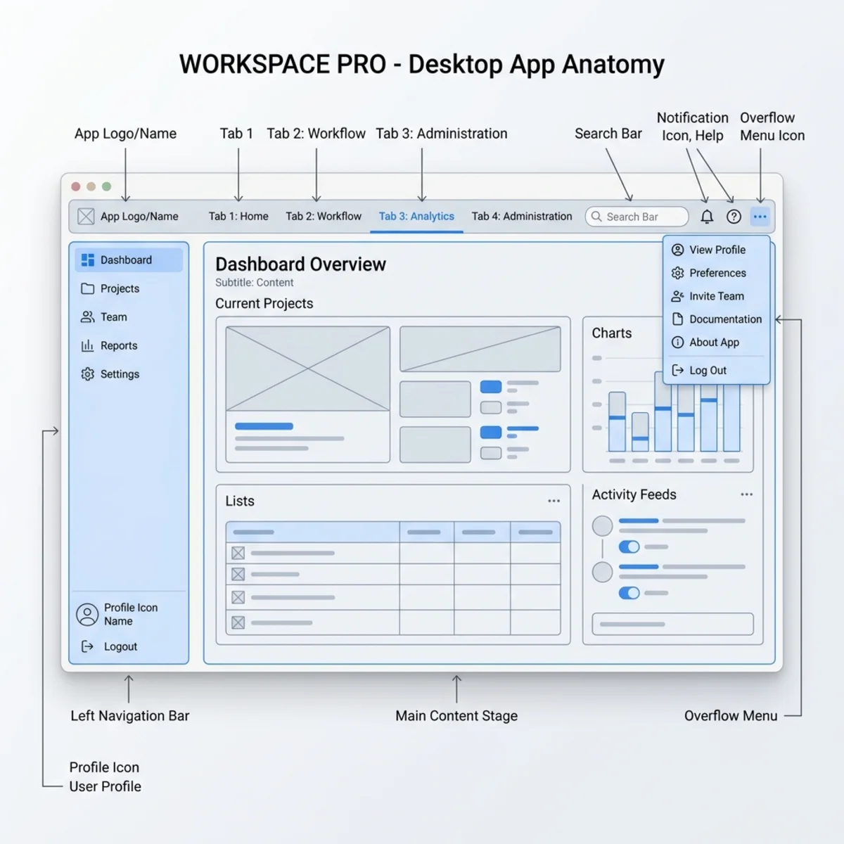
Engineering Personal Apps: Structural Anatomy and Governance
A Personal App within the Microsoft 365 ecosystem functions as a dedicated private workspace. Architecturally, it can render a complex data dashboard, an interactive content generation stage containing tables, a standalone bot experience, or an integrated combination of these components.
The 5 Core Visual Building Blocks
When mapping out the front-end layout using Fluent UI components, developers must match the five key structural elements defined by the kit’s native anatomy:
- App Name / Attribution: The top-level branding string establishing identity.
- Tab Strip: Contextual navigational headers dividing application views.
- Pop-out View Action: A dedicated system button enabling users to decouple the app into an isolated window.
- More Menu (…): An overflow container for secondary configuration settings or actions.
- App Tab inside the App Bar: The pinned left-rail icon acting as the primary launchpad.
Beyond these, the structural sub-components include the Left Nav, Toolbar, Stage, and the overarching Window.
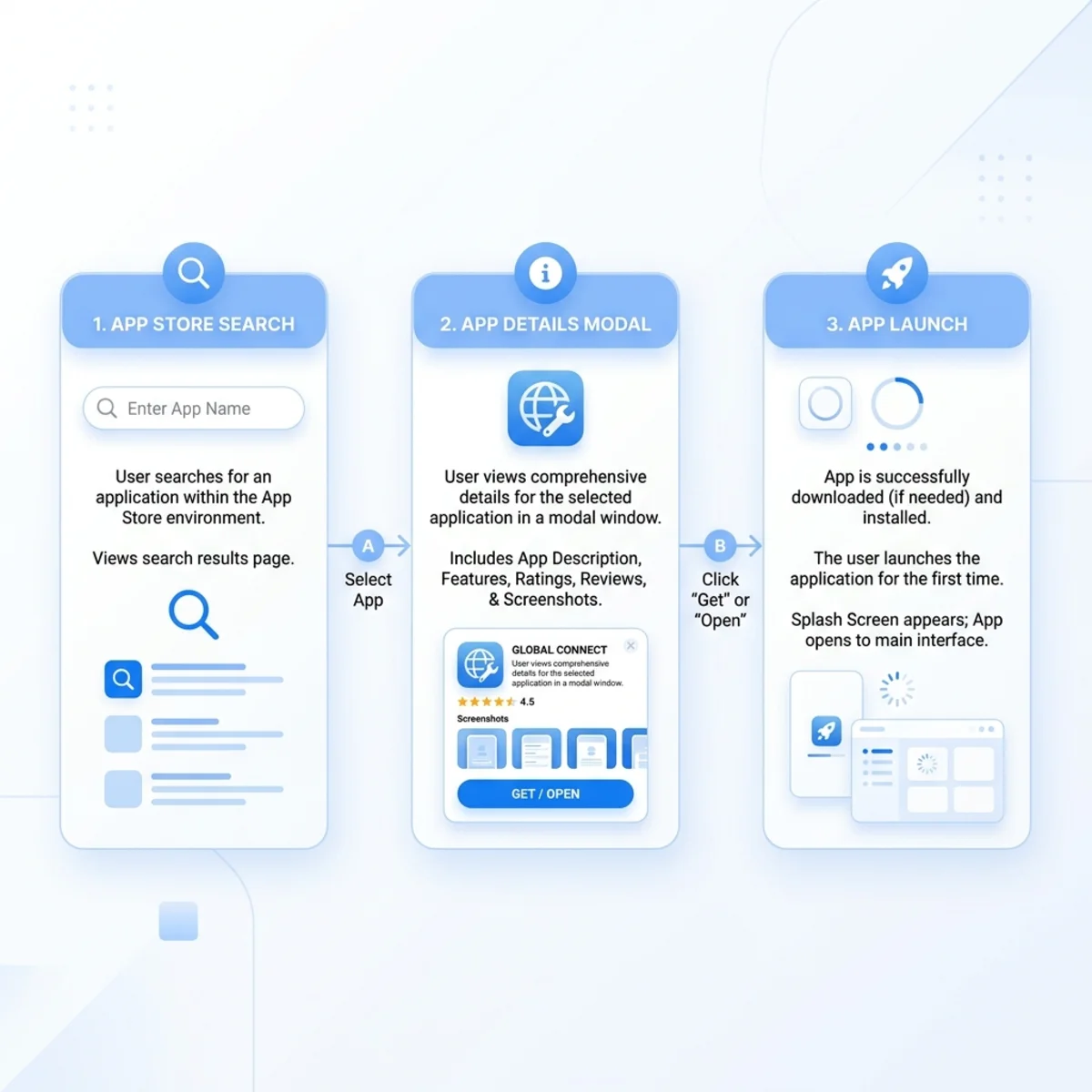
Store Discovery and Entry Lifecycles
The kit provides full layout states mapping out how your app initializes from the store environment. Your app logic must accommodate the Discovery Flow UI transitions seamlessly:
- Store Search / Discovery State: Rendering high-fidelity preview iconography inside the store gallery.
- App Details Modal: Displaying metadata capabilities, compliance links, and the primary Add trigger.
- First Run / Open State UI: Transitioning the user to an active instantiation where the button switches to Open.
UI Layout Governance
To maintain scalability, implement the internal app stage using Microsoft Fluent UI components. Adhere strictly to the following framework constraints:
| Operational Design Aspect | Recommended Approach (DO) | Anti-Pattern (DON’T) |
|---|---|---|
| Tab Priority | Surface primary, high-value workspace content on the leftmost tab. | Lead with secondary configurations, settings, or administrative logs. |
| Tab Hierarchy | Keep tabs strictly flat at the top level of the stage container. | Implement deep, multi-tiered nested tab configurations. |
| Navigation Mapping | Map tabs to high-level, unique app views (e.g., Dashboard, Analytics). | Use tabs to reflect deeply nested sub-pages or detailed transaction records. |
Fluent UI Scalability: Bypassing the structural nesting restrictions directly contradicts the design governance of the UI Kit and will likely result in a poor user experience.
Building High-Performance Conversational Bots (Teams-Specific)
Unlike cross-platform personal apps, the interactive conversational bots detailed within this kit are optimized exclusively for the Microsoft Teams canvas (Host Constraint).
Conversational UI Modalities
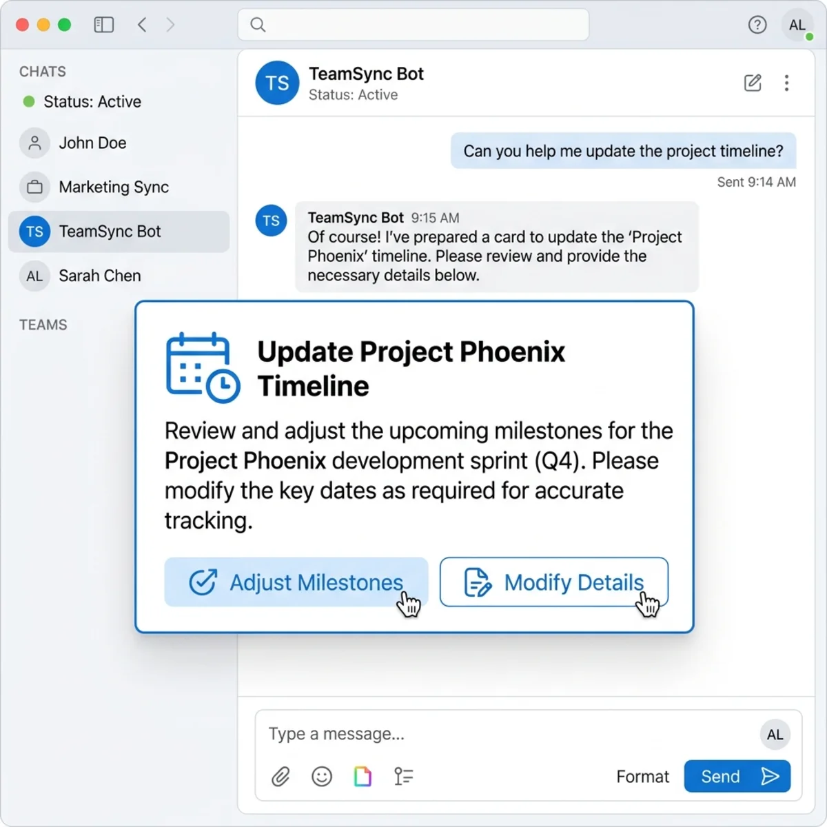
Bots must express data visually using structured card paradigms rather than dense text arrays:
- Suggestion Cards: Used for providing rapid-fire, single-click responses to guide user intent.
- Task Cards / Adaptive Cards: Dynamic JSON-defined layouts rendering custom buttons, rich text fields, and complex media elements natively inside the chat stream.
- Contextual Button placement: Strategically positioning actionable triggers directly within the cards for immediate user response.
Eliminating Conversation Fatigue (Design Optimization)
A common architectural flaw in enterprise bots is forcing users through exhausting multi-turn chat dialogues to collect data.
Architectural Paradigm Shift: If an interaction requires highly structured data inputs—such as specifying a due date, assigning project personnel, or typing long descriptions—do not use multi-turn chat messaging. Instead, replace complex multi-turn chats by triggering a Task Dialog or redirecting the user to an embedded Tab form.
Natural Language Processing (NLP) & Copy Best Practices
- Synonym Mapping & Intention Extraction: Users will prompt your bot using varied terminology to achieve identical results. Engineers should leverage a robust thesaurus strategy during the intent-extraction phase (e.g., mapping “Help”, “What do you do?”, and “How does this work?” back to a singular entry point).
- Onboarding Readiness Actions (Persona & Capabilities Disclosure): Avoid masking features. On initialization, the bot must state its concrete capabilities explicitly and offer clickable, ready-made commands to lower friction.
- Non-Query Handling (Graceful Fallbacks): If a user sends a casual input such as “Thank you”, replying with a generic parsing error like “I do not understand” damages UX. Build lightweight handlers to reply gracefully to conversational closures.
- Mobile Form Factor Responsiveness: Ensure that adaptive card button widths and layout groups scale gracefully down to mobile screens to guarantee complete operational parity with desktop clients on the mobile canvas.
App Store Submission Integration
Beyond simple layouts, the UI Kit outlines critical requirements for store deployment. When wrapping up your design phase, cross-reference your app manifest against the store submission prerequisites provided in the kit. Ensure your iconography, layout densities, and context scenarios align perfectly with the responsive and accessible blueprints required for successful review and publication in the Microsoft 365 store ecosystem.
Read next