5 UI Mistakes That Ruin Power Apps (And How to Fix Them)

Writer

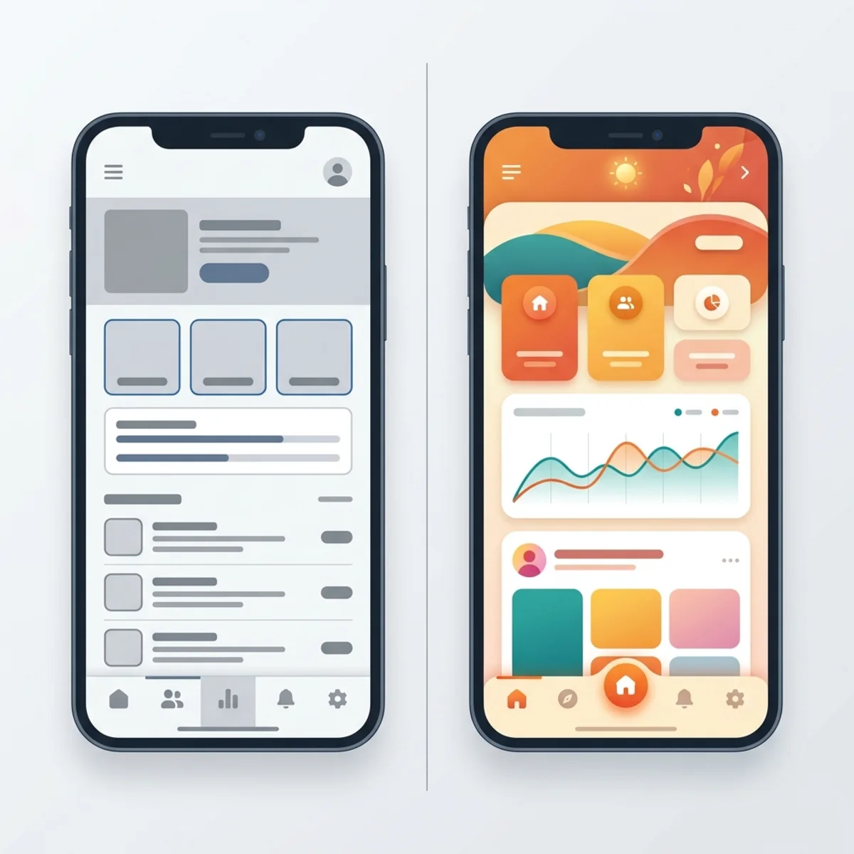
Most Power Apps look like they were built back in 2017, and it’s the single biggest reason business users ghost the app after week two. You open it up, see the default gray color everywhere, and you instantly know someone slapped it together in an afternoon.
Now, good components will take you a long way. But even the best components won’t save you if you keep making these five fundamental mistakes underneath them. Every ugly Power App I’ve seen gets at least three of these wrong. And once you see them, you can’t unsee them.
Having built dozens of these apps and looked at hundreds more, I’ve compiled the five specific mistakes you need to fix before you ship your next app. Let’s dive in.
Mistake 1: Picking the Wrong Color System
I don’t mean you just picked ugly colors; I mean the whole approach is off. Most makers open a new Power App and do one of two things:
- They keep the default blue and gray colors because they don’t want to mess with it.
- They grab the company brand color and paint it everywhere—on the buttons, headers, and whatever else they can find.
Both of these approaches make your app look amateur. Modern apps run off a palette: a primary color, a neutral scale for backgrounds and text, and a few semantic colors for success, warning, and error states.
Color inconsistency is the fastest signal that something was built by a non-designer. Fix the system, and you’ve already jumped ahead of most makers on day one.
The Fix
I built a free tool exactly for this called powercolors.dev.
- Pick a base color, and it generates a full, harmonious palette.
- The palette is already formatted as Power Fx variables, so you can paste it straight into your app.
- Drop those variables into your app’s formula section (they come with a name, but you can change it), and then reference those variables everywhere instead of hard-coding hex values on every control.
The Shortcut: If you already built your app and your colors are a mess, export the YAML of your screen. Paste it into Claude or ChatGPT and ask the AI to swap every hard-coded color for your new palette variables. It takes a few minutes, but it will save you an afternoon of manual work.
Mistake 2: Spacing and Alignment
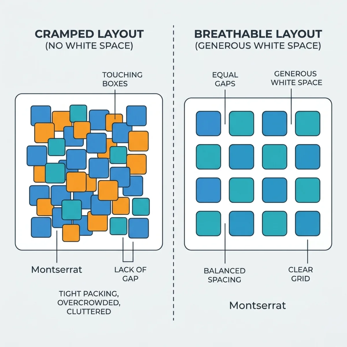
Power Apps, by default, cramps everything together. Labels sit two pixels above inputs, buttons touch each other, and cards have no internal padding.
Modern-looking apps need room to breathe. When you look at well-designed SaaS products, what you’re actually noticing isn’t just the colors or the fonts—you’re noticing the white space. Every element has room around it, and every group of elements has even more room around the group.
Even if users cannot explain why an app feels off, spacing is that invisible element that makes a huge psychological difference. And the best part? It’s cheap. You just need to give your controls more room.
The Fix
- Stick to a Spacing Scale: Your only allowed gap, padding, and margin values should be a structured scale—like 4, 8, 12, 16, etc. Do not use 7, 13, or 22. If you catch yourself typing a random number into a padding property, stop.
- Use Modern Containers: Use modern containers with the
gapproperty instead of manually positioning every element with X and Y coordinates. - Pick a Left Edge: For alignment, pick a left edge and stick to it. Your page title, section headers, form labels, and your first button should all share the exact same X coordinate. When they don’t, the eye picks it up immediately.
Mistake 3: Icons
The default Fluent icons from Microsoft are actually fine—they’re clean and render properly. The problem isn’t quality; it’s variety.
You get one style and a limited set of shapes, which means a lot of your specific use cases just can’t be represented. Every app you build starts looking exactly the same. On top of that, makers often mix icon styles on the same screen—like putting Fluent icons next to a random emoji. To the user, it just feels like visual noise.
If icons are inconsistent, the whole app feels off, even when everything else is right.
The Fix
- One Library Per App: Pick one icon library per app and commit to it. I use powericons.dev because it’s built specifically for Power Apps and pulls from libraries like Lucid and Hero Icons. You get thousands of icons, meaning every use case is covered.
- One Style Per App: Stick to one icon family and style. If you start with outlined icons, only use outlined. If you use filled, stick to filled. You can use both, but make it intentional (e.g., using an outlined house icon for the default state, and a filled house icon when it’s pressed).
- Consistent Sizing: Stick to specific sizing rules—like 16px, 20px, or 24px. Don’t use random numbers in between.
- Don’t Overuse Them: Icons should guide the user, not decorate your screen. Every button doesn’t need an icon, and every label doesn’t need a little picture next to it.
Mistake 4: Missing Feedback States
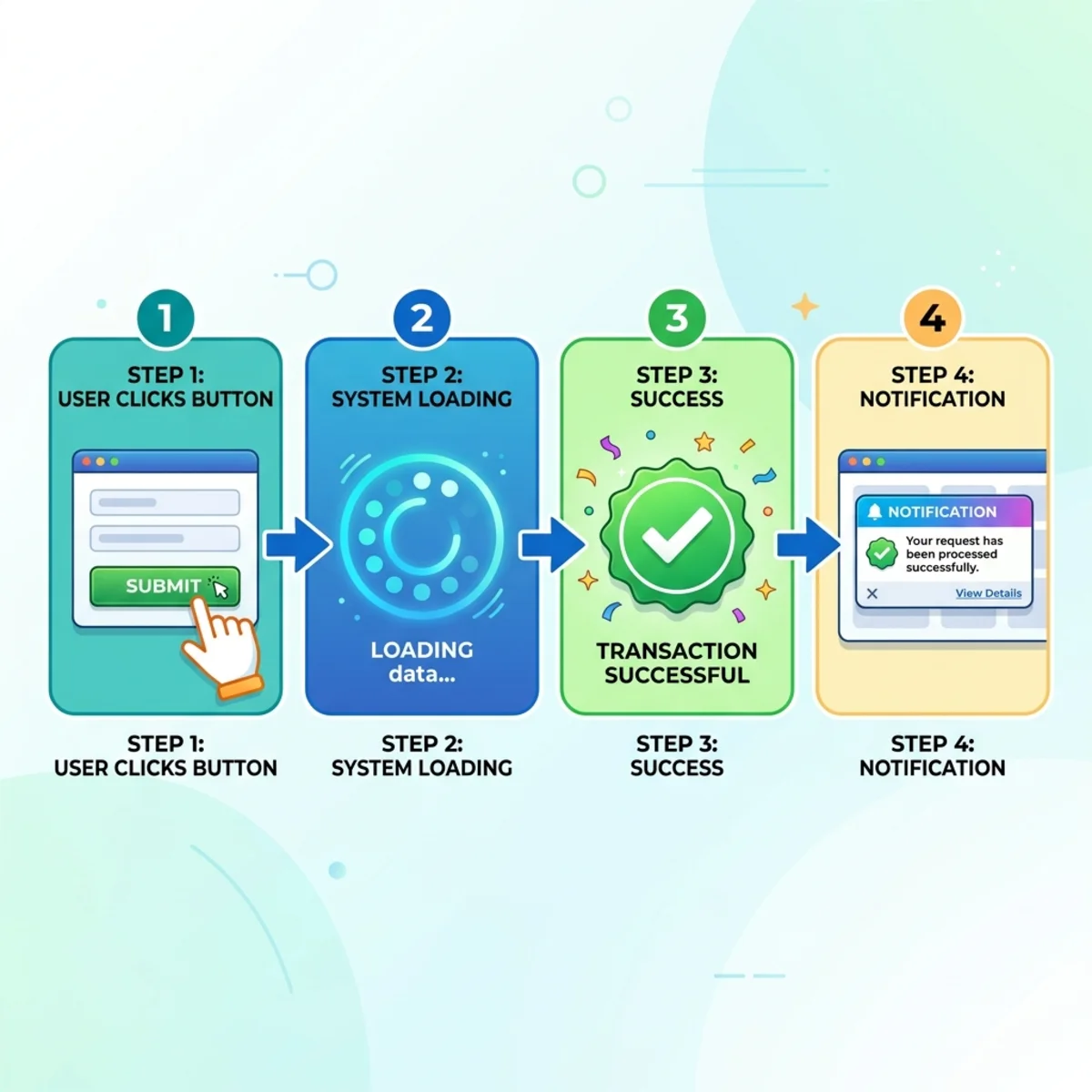
This mistake has nothing to do with looks and everything to do with what your app does. I’m talking about feedback states—what happens when a user clicks a button, submits a form, or waits for data to load.
In most Power Apps, you click ‘Save’ and nothing happens, the screen flickers, or you sit there for 4 seconds wondering if it actually submitted. Modern and professional apps never leave the user guessing.
The mental model is simple: assume the user knows absolutely nothing about what happens when they press a button. It is your job to tell them. Apps that give feedback feel fast even when they’re slow, and apps that stay silent feel broken even when they’re working perfectly.
The Fix
Every action needs a visible response:
- A button should change color for a moment when it gets pressed.
- A form submission should show a loading spinner.
- A successful save should flash a toast notification in the corner instead of silently navigating away.
- A failed action should clearly tell the user what went wrong.
You can build things like loading spinners, toasts, and modals once, and reuse them across all your future apps. If you don’t want to build a toast system or modal from scratch, you can grab them for free over at powerapps.com and drop them directly into your app.
Mistake 5: No Typographic Hierarchy
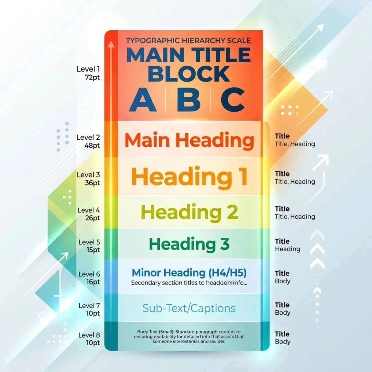
This one is subtle, but it makes a massive difference. In many apps, everything is exactly the same size, weight, and color.
Your page title is 16px, your section header is 16px, your body text is 16px, and the text above your input is 16px. If everything looks equally important, nothing is actually important. The user’s eye has nowhere naturally to land. Typography is how your app speaks to the user before they read a single word.
The Fix
Build a type scale. It shouldn’t be complicated:
- Set an Anchor: Start with the smallest size that feels right. For metadata (like timestamps and helper labels), my floor is usually around 9px or 10px.
- Scale Up Consistently: From there, step up. Labels might be 11px or 12px. Body text might be 13px. Section headers jump higher, and page titles are the biggest thing on the screen. The exact numbers depend on your app and user needs, but once you pick your 5 or 6 sizes, stick to them across every screen. No random 15s or 22s.
- Use Color for Hierarchy: Use your darkest neutral for headers, a slightly lighter one for the body, and a muted gray for supporting text. This allows the eye to move naturally from bigger/darker text to smaller/lighter text.
Bonus: Automate Your UI Audits
The cool thing about these five fixes is that none of them require any Microsoft premium licenses or special features. They are just foundational decisions you make before you start building.
If you want an easy way to check your work, I’ve put together a free AI skill file that you can drop into Claude.
Once loaded, you can show the AI screenshots of your Power App, and it will give you feedback based on the ACCEPT framework. It catches spacing issues, color drift, typography sizing, and asks about feedback states. It will even suggest exactly what to fix.
You can also head over to powerapps.com, go to the MCP section, and use the MCP together with your AI to get these capabilities locally.
Don’t let amateur UI ruin a great app. Fix your colors, align your spacing, standardize your icons, provide immediate feedback, and scale your typography. Your users will thank you.
Read next