Overcoming the Power Apps UI Bottleneck: 3 Hacks for Enterprise-Grade Development

Writer
If you have spent any significant amount of time building in Power Apps, you know the true time sink isn’t data connection or complex business logic. It’s the user interface.
Pixel-pushing elements, updating hexadecimal codes across dozens of individual controls, and watching a pixel-perfect desktop layout completely shatter on a tablet is an incredibly frustrating developer experience. To scale your output and maintain your sanity, you have to stop building screens like static slide decks and start treating Power Apps like the modern web framework it is under the hood.
Here are three architectural hacks that will dramatically reduce your UI development time and elevate your application’s reliability across all devices.
1. Bulk UI Manipulation using YAML and Generative AI
We talk a lot about AI orchestration and agentic workflows, but one of the highest-leverage, immediate use cases for LLMs in Power Apps development is code manipulation.
Everything you build on the Power Apps canvas is fundamentally YAML. While most developers use the copy/paste feature just to duplicate controls, you can extract this YAML, feed it to a highly capable LLM (like Claude Opus or GPT-4), and perform structural changes that would normally take hours.
Instead of clicking through 30 individual components to change an accent color from blue to green, copy the entire block of raw YAML code directly from the Power Apps controls. Paste this raw YAML into your AI interface with a prompt like:
“I have this Power Apps YAML code. Can you update the styling so that all primary blue accent colors are changed to red, and ensure all controls follow a standard CamelCase naming convention?”
The AI natively understands the schema. It will execute these massive bulk UI updates and return fully formatted YAML that you can paste directly back into the studio.
Pro-Tip: You are not limited to colors. You can instruct the AI to perform advanced transformations such as injecting consistent container padding to all containers, standardizing font sizes, or even converting a horizontal layout into a vertical one.
Quality Assurance is Key: Always perform a quick visual verification after pasting the output back into the canvas. AI can occasionally hallucinate non-existent properties, but this trick works flawlessly 95% of the time.

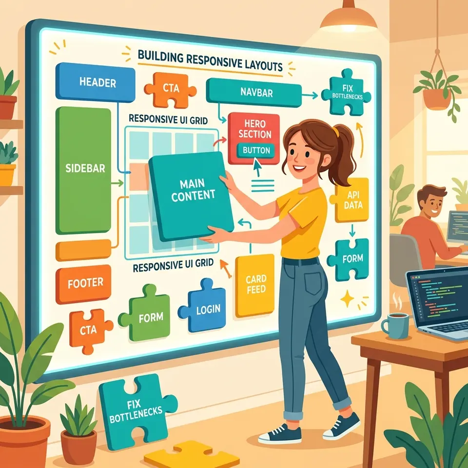
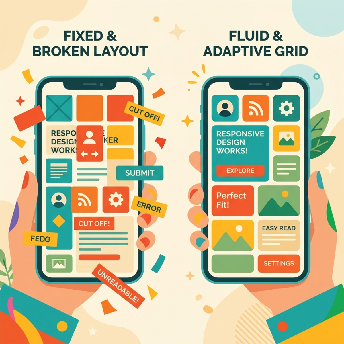
2. Ditching X/Y Coordinates for Relational Layout Systems
If your app falls apart on different screen sizes, it is because you are relying on absolute positioning. Dragging a button to a specific absolute X/Y coordinate ensures it will stay there forever, completely ignoring the viewport of the device.
To build truly responsive applications, you must enable the “Responsive” setting in your app’s Display Settings to remove fixed canvas constraints. Once enabled, abandon absolute positioning and migrate entirely to Containers (Horizontal, Vertical, and Grid). When you utilize responsive containers, you stop dictating exactly where an item lives, and start dictating how it behaves relative to its surroundings.
Mastering Breakpoints with App.Size
Power Apps evaluates the active window and assigns it an integer representing the screen tier. Phone screens return 1, tablets return 2, and desktop/windowed screens return 3 or 4. By referencing the App.Size or App.ActiveScreen.Size property, you can build dynamic, conditional logic directly into your UI:
- Dynamic Navigation Rendering: A sidebar is great on a desktop but terrible on a phone. Set your sidebar container’s
Visibleproperty toApp.Size >= 3to hide it on mobile. Then, create a bottom navigation bar container and set its visibility toApp.Size <= 2to reveal it on smaller screens. The app will now seamlessly transition its core navigation based on the device breakpoint. - Dynamic Modal Sizing: If you have a pop-up modal, it shouldn’t be a fixed width on a mobile device. Write conditions for component widths, such as setting the modal’s width property to evaluate the screen:
If(App.Size = 1, Parent.Width, 400). This guarantees a full-screen experience on phones while maintaining a clean, fixed 400px dialog on larger screens. - Handling Overflow: When placing a row of buttons in a Horizontal Container, a narrower screen will simply cut them off. Select the container and set the
Wrapproperty totrue. This ensures components stack vertically on narrower screens rather than being cut off. - Mathematical Centering: Sometimes you need precise control without a container’s auto-layout. You can center components dynamically using the formula:
Parent.Width / 2 - Self.Width / 2. This ensures the component stays perfectly centered regardless of the screen size.
Advanced Spacing Metrics
Stop using margin properties on individual components. Instead, utilize the “Layout Gap” property at the container level for consistent, mathematically precise spacing between controls.
Furthermore, utilize “Fill Portions” to divide available space and create proportional layouts. If you want an equal 50/50 split, set equal values for both columns. If you want a 25/75 screen split, set the left container’s fill portion to 1 and the right container’s fill portion to 3.
By employing container nesting—stacking layout logic by placing horizontal containers inside vertical ones—you establish structured rows and columns that create an unbreakable, highly professional grid.
3. Managing Assets Declaratively with App.Formulas
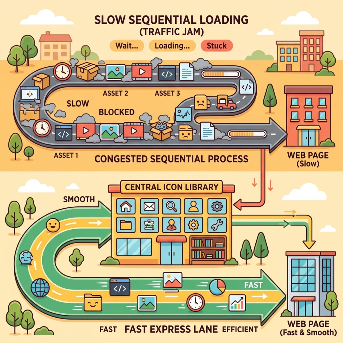
The standard approach to custom SVG icons in Power Apps is brutally inefficient: encode the SVG, paste it into an Image control, and repeat. If your client decides they want a different style of “Home” icon, you have to hunt down every instance of that image across your entire application.
While some developers try to solve this by storing SVGs in variables via the App.OnStart property, this is a flawed architecture. Understanding the difference between declarative vs sequential loading is critical: App.OnStart runs sequentially and blocks app loading. The more assets you cram into it, the slower your application takes to initially load.
The modern solution is App.Formulas.
Formulas are declarative and load faster. They do not block the application from loading; they simply exist in the background, ready to be called. You can build a centralized asset management system by creating a global SVG icon dictionary directly inside App.Formulas instead of manually pasting encoded SVGs into individual image controls:
This creates a Single Source of Truth. Throughout your app, your image controls simply reference icons globally via syntax like MyIcons.Home. If you ever need to update that graphic, you replace the single string of SVG code inside your formula, allowing for instant, app-wide updates by changing a single line.
To accelerate this workflow even further, leverage external workflow acceleration tools like PowerIcons.dev. You can visually select icons, and the tool will automatically generate the exact formula code required for Power Apps, ready to paste directly into your environment.
The Shift in Mindset
Building enterprise-grade tools requires an enterprise-grade approach to the canvas. By offloading tedious YAML manipulation to AI, structuring your screens with relational flex-containers, and managing your graphical assets declaratively, you stop reacting to the UI and start architecting it.
Read next