Agentic Power BI: Claude MCP, Custom Visuals & Copilot CLI

Writer

The era of manual, drag-and-drop Power BI development is facing a profound shift. A common fear echoing through the data community lately is: “If AI can do everything, why should I invest time in learning Power BI?” The reality is the opposite. AI isn’t here to replace Power BI — it’s here to be integrated seamlessly into it. The analysts who win are the ones who learn to direct the agent, not the ones who hope it never arrives.
By treating BI development as an agentic, code-generation task rather than a manual UI exercise, you can skip the tedious parts — writing boilerplate DAX, fighting inflexible native visuals, formatting matrices by hand — and spend your time on the parts that actually need judgment.
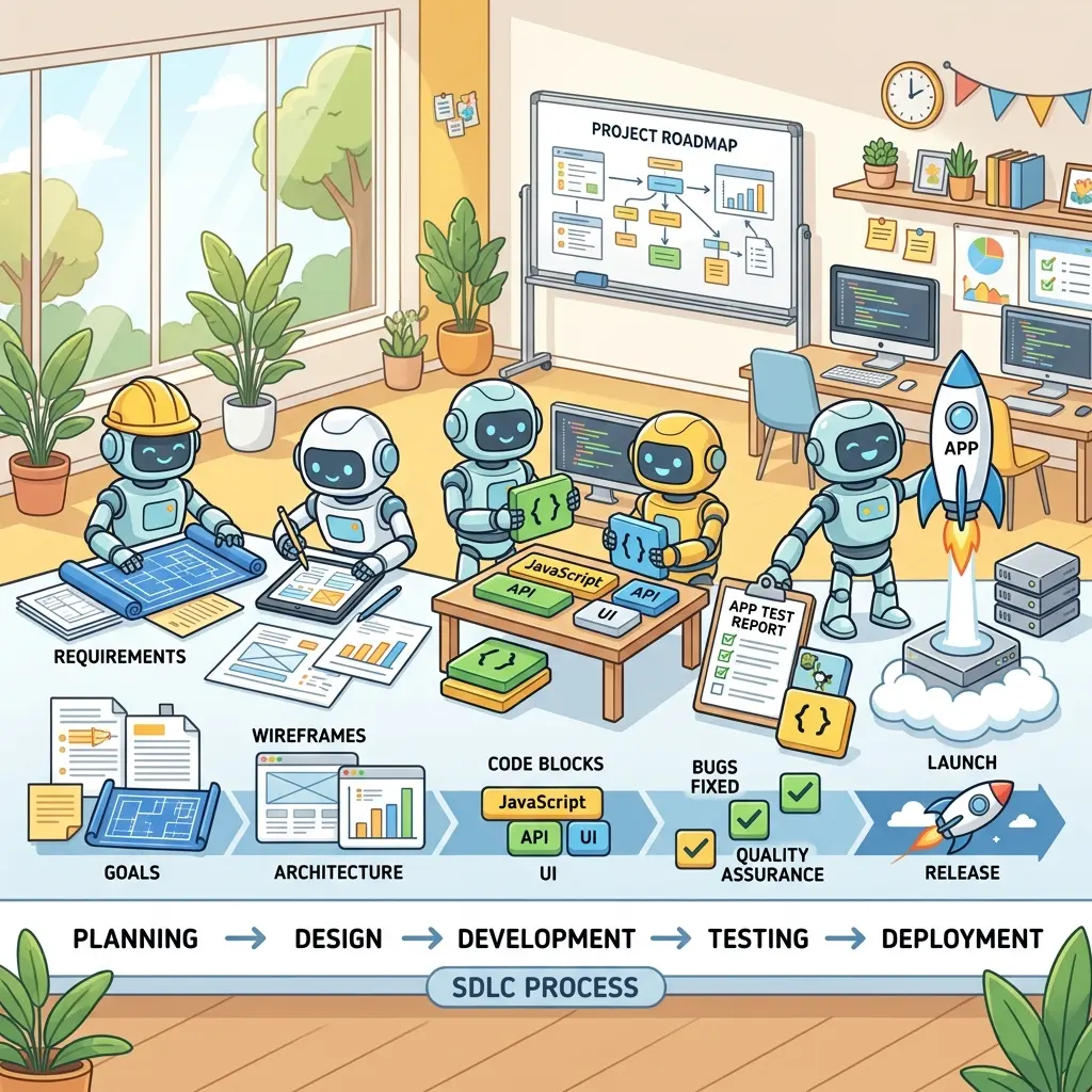
This guide is meant to be followed, not just read. Every section has the exact prompts, config, and code you need to reproduce the result yourself. We’ll cover three complementary approaches:
- Integrating Claude with the Power BI Modeling MCP server to automate DAX and data modeling.
- Building completely custom visuals using Claude, the HTML Content visual, and Deneb.
- Automating entire report designs using the GitHub Copilot CLI and Microsoft Fabric report skills.
These three approaches are layers, not rivals. The MCP server owns the data model (tables, measures, DAX). HTML/Deneb own individual custom visuals. The Copilot CLI skills own the whole report layout (pages, visuals, theme). A serious agentic workflow uses all three together — model first, then layout, then polish.
Which approach should you use?
| You want to… | Use | Output it touches |
|---|---|---|
| Generate date tables, measures, time intelligence, descriptions | Power BI Modeling MCP server (Part 1) | The semantic model / DAX |
| Build one bespoke visual native Power BI can’t do (variance cards, bullet charts) | Claude + HTML Content / Deneb (Part 2) | A single visual on the canvas |
| Generate or restyle an entire multi-page report from a prompt or a screenshot | Copilot CLI + Fabric report skills (Part 3) | The whole report layout (PBIR) |
What you’ll need (one-time setup)
- Power BI Desktop (latest version) — and turn on Preview features → Power BI Project (.pbip) save option under File → Options and settings → Options → Preview features. Several workflows below depend on it.
- Visual Studio Code — used to host the MCP server and, in Part 3, the Copilot CLI.
- Claude Desktop (Parts 1–2) — the free tier with Sonnet set to High effort is enough for everything here.
- Two free AppSource visuals (Part 2): HTML Content (Viewer) and Deneb.
- A semantic model with real relationships. The agent is only as good as the schema you give it. A pile of unrelated tables produces unreliable DAX.
Part 1: Supercharge Power BI with Claude AI (The MCP Integration)
The Power BI Modeling MCP Server is a first-party Microsoft component (published on the VS Code Marketplace by analysis-services, with 150k+ installs). MCP — Model Context Protocol — is an open standard that lets an AI assistant call external tools through a small local “server.” In plain terms: it’s the bridge that lets Claude reach into your open Power BI model and actually change it, instead of just printing DAX for you to copy.
Once it’s connected to your active Power BI file, you control the model with conversational prompts. Here’s what it’s genuinely good at.
Top AI Hacks for Power BI
1. Instant Date Table Generation
Building a proper date table usually means dozens of lines of DAX for year, quarter, month, and day-name columns. Instead, prompt:
“Create a date table from 2021 to 2027 with Year, Quarter, Month, MonthName, WeekOfYear, DayName, and an IsWorkday flag. Mark it as a date table.”
Claude generates the full table (roughly 2,500 rows and a dozen-plus columns) directly in your model and flags it as the official date table so time intelligence works.
2. Bulk DAX Measure Creation
The Modeling MCP can auto-detect and create relationships between imported tables (Customer, Products, Sales, Territories). After loading your core tables, prompt:
“Create a base set of measures for this model — totals, averages, counts, and ratios — and organize them into display folders by topic.”
It can produce dozens of foundational measures at once and sort them into folders like Date Intelligence or Period Comparison, with no manual coding.
3. Advanced Time Intelligence at Scale
Time intelligence is critical and miserably repetitive. Prompt:
“Generate MTD, QTD, YTD, prior-year, year-over-year %, 3-month moving average, and rolling-sum variants for my key measures.”
The server populates the model with the full matrix of comparisons in one pass.
4. Automated DAX Commenting
Inheriting an undocumented model is a nightmare. Ask:
“Add line-by-line comments to each measure so a DAX beginner can follow the logic.”
It parses your existing measures and writes explanatory comments into the formula text itself.
5. Smart Column and Measure Descriptions
The Description field on most columns and measures sits empty. Prompt:
“Write a clear business description for every measure and column.”
Now anyone hovering a field in the model view — or any agent reading the schema later — instantly understands its purpose. (This one pays off doubly: good descriptions make every future AI prompt more accurate.)
6. End-to-End PDF Documentation
At handover time, ask:
“Produce end-to-end documentation of this model as a structured report — relationships, measure catalog, and architecture overview.”
The agent analyzes the whole model and generates a multi-page document (index, scope, architecture, measure-by-measure reference) you can save as a PDF.
Productivity tip: speak your prompts. If you pair AI coding tools with Power BI all day, typing long prompts and tagging files by hand is the bottleneck. Voice-dictation tools (e.g. WisprFlow / Whisper-based dictation) let you talk at ~160 words per minute versus ~40 typing — far less friction between your idea and the agent’s execution.

Step-by-Step Installation and MCP Setup
Connecting Claude to Power BI means registering a local MCP server in Claude’s config. Precision matters — one missing comma or backslash breaks the whole thing.
Prerequisites
- Power BI Desktop — install from the Microsoft Store and open it once.
- Visual Studio Code — install the Windows build from the official site.
- Claude Desktop — install the Windows app and sign in.
Install the MCP server extension
- In VS Code, open the Extensions tab (left sidebar).
- Search for Power BI Modeling MCP Server (publisher: Microsoft / analysis-services) and click Install. If asked, choose Trust Workspace and Install.
- In File Explorer, paste this into the address bar to open your extensions folder:
%USERPROFILE%\.vscode\extensions - Open the folder whose name starts with
analysis-services.powerbi-modeling-mcp-…, go into theserversubfolder, and find the server executable (a.exe). - Right-click the executable → Copy as path. Paste it into a scratch Notepad — you’ll need it in a moment.
You may not need Claude Desktop at all. This same extension runs as an MCP
server inside VS Code’s GitHub Copilot chat. If you’d rather stay in VS
Code, skip the Claude config below, open Copilot Chat, confirm
powerbi-modeling-mcp is selected, and jump straight to “Connect to your
model.” The Claude Desktop route below is for people who prefer Claude’s
chat experience.
Register the server in Claude
- Open Claude Desktop → menu (top-left) → File → Settings → Developer.
- Click Edit Config under Local MCP Servers. This opens
claude_desktop_config.json. Open it in a code editor (VS Code is ideal — it validates JSON as you type). - Add a
powerbi-modelingentry to themcpServersobject. This is the piece the original instructions left out — here’s the exact shape:
Replace the command value with the exact path you copied in step 5, and keep args as an empty array unless the server’s GitHub repo tells you otherwise. If you already have other servers in mcpServers, add powerbi-modeling alongside them (mind the comma between entries).
The backslash trap (this breaks more setups than anything else). JSON
treats \ as an escape character, so every single backslash in your Windows
path must be doubled. C:\Users\You\... must become
C:\\Users\\You\\.... A path with single backslashes produces an invalid-JSON
error and the server silently won’t load. Paste your path into a JSON linter
before saving if you’re unsure.
Connect to your model
- Fully quit and reopen Claude Desktop so it reloads the config — use Quit from the system tray, not just the window’s X. (You do not need to restart your whole computer.)
- Back in Developer Settings, confirm
powerbi-modelingshows as running, and look for the 🔨 tool icon in the chat box — that’s your sign the tools loaded. - Open the file you want to work on in Power BI Desktop (it must be open for the connection to find it).
- In Claude, run the connect prompt using your actual file name:
“Connect to ‘Sales Analytics’ in Power BI Desktop.”
When you get a success message, the link is live and every hack above is available.
Troubleshooting — if the connection fails: - Server not “running” / no
🔨 icon → almost always invalid JSON. Check for un-doubled backslashes, a
missing comma, or a stray quote. Open the config in VS Code; red squiggles
point straight at the problem. - “Can’t find the file” on connect → the
file must be open in Power BI Desktop, and the name in your prompt must match
the title exactly (without the .pbix). - Tools load but changes don’t
stick → make sure the model finished loading in Desktop, and that you’re not
also editing the same measure by hand at the same time. - Nothing works
after edits → quit Claude from the tray and reopen; a half-reloaded config
behaves unpredictably.
Treat the agent like a developer with write access — because it is. The
MCP server acts with your credentials and Fabric/RBAC permissions, and bulk
operations can touch hundreds of objects at once. Before you let it loose:
save (or commit) a known-good copy of your .pbip so you can roll back, and
review bulk or delete prompts before running them. There’s no universal “undo”
for an autonomous edit.
Part 2: Building Custom Visuals with Claude, HTML Content, and Deneb
If you own financial or corporate dashboards, this monthly ritual will feel familiar: Power BI holds all your live, accurate data, but when it’s CFO-deck time, someone is still exporting tables to Excel, formatting by hand, and pasting screenshots into PowerPoint.
The core problem: native visuals fall short of strict finance requirements. KPI cards don’t easily flip red/green on custom variance logic (where higher revenue is good but higher expense is bad). Tables struggle to show dollar and percent variance side-by-side. And a proper bullet chart simply doesn’t exist out of the box.
The fix: combine Claude (free tier, Sonnet, effort High) with two free AppSource visuals — HTML Content (Viewer) and Deneb.
Give the AI your real schema (the .pbip method)
The single biggest mistake when asking AI to write DAX or visual code is letting it guess your table and column names. Guessed names = broken visuals. So hand Claude the exact schema:
- Save as a project. In Power BI Desktop, File → Save As and change the type from
.pbixto Power BI Project (.pbip). (If you don’t see it, enable the.pbippreview feature first — see What you’ll need.) - Find the model definition. In File Explorer, open your project folder →
<Name>.SemanticModel→definition. - Grab the TMDL files. The
.tmdlfiles are lightweight text files that map your database, model, and each table — names, data types, relationships. - Feed the AI. Upload those
.tmdlfiles into your Claude chat. Now Claude knows your exact tables, columns, and relationships — no guessing.
Don’t have a huge model? You can also just paste the relevant table/column
names into the chat. The .tmdl route is best when relationships and data
types matter (which, for finance variance logic, they always do).
Tool 1: HTML Content (Viewer)
HTML Content is a free AppSource visual that renders an HTML string — produced by a DAX measure — directly on the canvas. Because you generate the HTML, you control every pixel.
Install: in the Visuals pane click the … → Get more visuals → search AppSource for HTML Content (by Daniel Marsh-Patrick) → Add.
Build 1 — Dynamic variance KPI card
Goal: a card showing actual, budget, dollar variance, and percent variance, that flips green/red on direction — and respects that higher revenue is good but higher expense is bad.
Prompt:
“Act as an expert Power BI designer. I have an HTML Content visual on my canvas that renders an HTML string from a DAX measure. Using the attached .tmdl files, write the DAX. I want a KPI card showing actual vs. budget in dollars and percent. The card must flip red/green by variance direction. Do one version for Revenue (higher = green) and one for Expenses (higher = red).”
What Claude returns is a measure that builds an HTML string — it looks roughly like this, so you know what “good” output is:
Create a New measure, paste it in, then drag the measure onto the Values field of the HTML visual. For the Expense card, you simply invert the color test — IF( _VarAmt <= 0, "#1B7F3B", "#C0341D" ) — because under-spending is the good outcome.
Build 2 — Multi-location benchmarking table
Goal: a table comparing several metrics (COGS, Labor, Marketing, Net Profit) across locations versus the business average, with colored dots for favorable/unfavorable.
Prompt:
“Continue as a Power BI expert. Build an HTML metrics table comparing three locations and the total business. Show COGS %, Labor %, Marketing %, and Net Profit. Add a colored dot per cell showing favorable/unfavorable versus the overall average (remember: lower cost % is favorable, higher Net Profit is favorable).”
Claude only has your schema, not your rows — so it may ask how to treat missing values or which average to benchmark against. Answer those, take the generated DAX, and drop it into a fresh HTML visual.
Tool 2: Deneb (Vega-Lite)
HTML Content is ideal for text and tables. For real charting, use Deneb — a free AppSource visual that renders declarative Vega or Vega-Lite JSON specs.
Install: add Deneb from AppSource the same way (… → Get more visuals → search Deneb → Add).
Build 3 — The finance-standard bullet chart
The bullet chart is the finance standard for actual-vs-budget: a primary bar for actuals against a reference for the budget.
Prompt:
“Now we’re using Deneb (Vega-Lite). Build a horizontal bullet chart of Revenue Actual vs. Revenue Budget for each location. First tell me exactly which fields to drag into the visual, then give me the Vega-Lite spec.”
The workflow — order matters:
- Claude tells you which fields to add (e.g. Location, Revenue Actual, Revenue Budget). Drag those into Deneb’s data roles first.
- Click Edit on the Deneb visual.
- Choose Create new specification → Vega-Lite → Empty template.
- Paste the spec. Here’s a working starting point you can drop in and adapt:
That renders a grey “budget” band, a blue “actual” bar, and a dark target tick at budget — per location. Deneb exposes the visual’s data as a table named dataset, which is why the spec references {"data": {"name": "dataset"}}.
Field names must match — exactly. This is the #1 reason a Deneb chart
renders blank. The field strings in the spec ("Revenue Actual",
"Revenue Budget", "Location") must match the field names in Deneb’s data
roles character-for-character, including spaces and capitalization. If a
chart comes up empty, check the names before anything else.
Business impact: combine Claude, HTML Content, and Deneb and you remove the ceiling on what Power BI visuals can look like — automating hours of manual reporting and killing the monthly PowerPoint rebuild for board decks.
Part 3: Agentic Reporting — Automating Report Design with the Copilot CLI and Fabric Skills
Microsoft’s Skills for Fabric introduced a fundamentally different approach: Power BI report skills that let you orchestrate report creation entirely from a terminal agent, rather than clicking through the UI.
Heads up: this is a preview feature. The report skills are officially in preview, the exact CLI command syntax is still evolving, and they work only with PBIP files. Treat the commands below as the current shape, but check the Skills for Fabric repo and the Power BI Report Authoring docs for the up-to-date commands before you run them.
The architecture: code-centric BI
The workflow saves your Power BI file locally as a Power BI Project (.pbip), which exposes the report layer as PBIR JSON definitions. Instead of clicking menus, you drive a CLI agent — the GitHub Copilot CLI — backed by local MCP servers. The agent edits the PBIR JSON directly, making structurally correct changes before you even open Power BI Desktop. (The same skills are cross-compatible with VS Code Copilot, Claude Code, Cursor, Codex, and Windsurf, so you’re not locked to one tool.)
Installation workflow
Navigate to the directory containing your .pbip file (which should already include its semantic model), then:
- Install the GitHub Copilot CLI in your terminal (if it isn’t already).
- Add the Skills for Fabric marketplace — Microsoft’s first-party catalog of Fabric agent skills.
- Install the Power BI authoring plugin from that marketplace (it bundles all the report skills together).
- Verify the skills loaded — list the installed skills and confirm the report skills appear.
Exact commands shift during preview, so confirm them against the
marketplace repo. As of writing the flow looks like: add the
microsoft/skills-for-fabric marketplace, install the powerbi-authoring
plugin, then list skills to verify. Because the plugin bundles them,
installing it once gives you all four report skills below.
The four core report skills
All four ship in the same authoring plugin and are designed to be used together:
- Power BI Report Planner — orchestrates the end-to-end build: gathers requirements, inspects the semantic model, and produces an approved implementation plan that drives the others.
- Power BI Report Design — your visual strategist: sets page archetypes, layout variants, chart choices, color maps, and typography before authoring begins.
- Power BI Report Authoring — the execution engine: writes the PBIR JSON to generate pages, visuals, filters, slicers, and formatting, and validates the result for structural correctness.
- Power BI Report Management — handles deployment, using the Fabric REST API to publish your local
.pbipdefinitions to a workspace.
Agent execution & generative creation
With the skills active, you build report pages from natural language against your existing semantic model:
“Create an overview page for my sales analytics, plus a second page with store details.”
You’ll watch the agent invoke the Report Authoring skill, analyze your semantic model, and autonomously generate the JSON that renders revenue tables, category charts, and store filters — bound to the right fields.
Visual cloning via “design inspo”
The most striking capability is cloning a design you admire:
- Find a sketch, UI mockup, screenshot, or dashboard you like.
- Save the image (e.g.
design-inspo.jpg) into your.pbipworking directory. - Prompt: “Create a new sales performance report using design-inspo.jpg as visual inspiration.”
The agent extracts structure, color hex codes, font hierarchy, and details (like rounded corners) from the image and injects them into the report’s theme and visual configs — mimicking the layout, colors, and typography.
A realistic end-to-end loop
The skills are most powerful chained together. A typical agentic build looks like this:
- Model → use the Modeling MCP server (Part 1) to ensure the semantic model has the tables and measures the report needs.
- Author → use the Report Authoring skill to write the PBIR pages, visuals, and formatting.
- Validate → run the skill’s
validate-reportstep to catch structural problems before they reach Desktop. - Verify visually → reload Power BI Desktop and screenshot it to confirm the visuals render (no error icons, no empty frames).
- Iterate → hand the screenshot to a design-review pass and repeat until both validation and the visual check pass.
Two rules that save you real pain in preview: 1. The PBIR file is the
source of truth. Save your manual changes in Power BI Desktop first. If you
have unsaved Desktop edits and then ask the agent to iterate, it reads the
on-disk PBIR and your unsaved work is silently ignored. 2. Commit a baseline
to source control before letting the agent edit. The skills modify JSON on
disk directly — a Git commit (or a copied folder) is your only clean way to
revert. 3. Avoid soon-to-be-deprecated visuals (Q&A, Bing maps, filled maps).
Don’t prompt the agent to create them; ask for modern cardVisual and
pivotTable visuals instead.
Enterprise use cases and scaling
This scales powerfully for organizations. Feed the agent your organizational styling patterns and rules — official UI patterns, color-accessibility requirements, and layout standards — by placing them in a standard folder the agent reads. Every new report the Copilot CLI generates then deterministically adheres to your corporate governance, so brand consistency stops being a manual review step.
Putting it together
The throughline across all three parts is the same: stop clicking, start directing. Hand the agent your real schema, let the Modeling MCP server build and document the model, let Claude render the visuals native Power BI can’t, and let the Copilot CLI skills assemble — and govern — the whole report. Start with one piece (the Modeling MCP server is the easiest win), get comfortable reviewing what the agent produces, and layer the rest in. The goal isn’t to remove yourself from the loop — it’s to spend your time on the decisions that actually need a human.
Read next