Building Tab-Driven Apps in Power Apps

Writer
In traditional canvas app development, the instinct for handling complex data models or multi-step processes is often to create multiple screens. Developers build a screen for this, a screen for that, link them together with a web of Navigate() functions, scatter back buttons everywhere, and add a custom burger menu.
Before you know it, the application feels less like a fluid, modern digital platform and more like a clunky PowerPoint presentation.
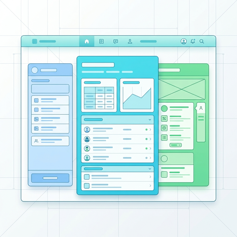
Modern mobile and web ecosystems—such as Facebook Marketplace or LinkedIn—do not force users across disruptive screen changes. Instead, they leverage single-screen layouts that dynamically swap content based on a unified tabular experience. Keeping users within a single layout while dynamically toggling content container visibility results in lower app overhead, zero screen-transition lag, and a clean user experience.
Here is a deep technical guide on how to build a responsive, single-screen tabbed architecture in Power Apps using modern controls, parent containers, and reactive state variables.
Prerequisites and Environment Preparation
To implement this layout pattern, you must ensure your application environment is configured to use Microsoft’s modern control library.
- Navigate to the Settings menu inside your Power Apps Studio editing session.
- Under the Updates tab, locate the Modern controls and themes feature flag.
- Toggle the setting to On.
Once enabled, make sure to connect your application to your necessary background data tables (such as your employee roster, compliance logs, or performance score registries) via the Data pane.
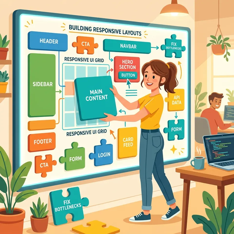
Layout Architecture & Container Hygiene
The backbone of a clean, responsive single-screen experience relies on strict layout grouping. We avoid placing individual controls directly onto the screen canvas. Instead, we use nested structural containers.
1. Structural Setup
First, insert a main outer layout container onto your blank screen to hold all your structural elements. Next, insert a child container at the top of the canvas to act as the navigation header.
For this navigation header container:
- Disable the Flexible height property.
- Set the Height property strictly to
60.
2. Eliminating Padding Bleed
A common mistake when nesting modern controls inside container layouts is leaving the default margins intact. This causes components to misalign or bleed outside visible parent boundaries.
Select your newly created navigation header container, locate the Padding configurations in the properties panel, and zero out all edges:
PaddingTop = 0PaddingBottom = 0PaddingLeft = 0PaddingRight = 0
Configuring the Modern Tab List Data Model
With the header container prepared, insert a modern Tab List control (TabList) inside it.
To ensure the navigation scales across various browser and mobile display factors, change the control’s layout width parameter to match its container exactly:
Advanced Tab Modeling with Power Fx
By default, the modern Tab List control populates its Items property with a simple single-column text array (["Item 1", "Item 2", "Item 3"]). While functional for basic text display, this layout format fails when handling complex state-driven architectures.
To build a robust app, replace that simple array with a explicitly typed table containing structured records. Each record will track a display text attribute (Value) alongside a distinct numeric identifier key (UniqueId):
Formatting your Items property like this explicitly links each visual label to an immutable, database-friendly integer ID.
| Value (Text) | UniqueId (Number) |
|---|---|
| “Employee List” | 1 |
| ”Discipline List” | 2 |
| ”Performance Scores” | 3 |
Visual and Functional Overrides
The modern Tab List control comes packaged with native design flexibility via its property panel:
- Appearance: Toggle from Transparent (a sleek classic style) to Filled circular to match pill-shaped modern UI standards.
- Alignment: Switch between Horizontal (ideal for top desktop navigation views and bottom mobile bars) and Vertical (perfect for left-hand sidebars).
- Color Palette: Change the theme colors to alter the highlight indicator—such as applying a clear green underline to draw focus to active tabs.
State Management and Dynamic Visibility
The magic of single-screen applications happens by binding the selection state of your navigation header directly to the visibility engines of your content layouts.
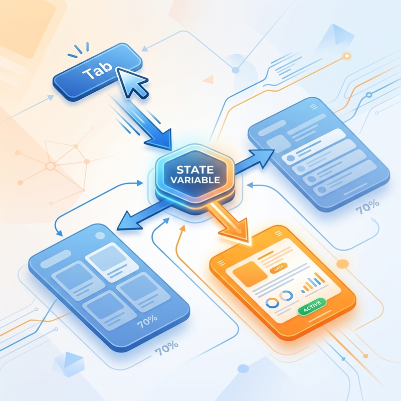
1. Capturing Selection State via OnSelect
Select your Tab List control, find its OnSelect code block property, and initialize a global application state variable using the Set() function. This action captures the custom identifier of whichever item the user selects:
Whenever a user selects an item on the navigation header, varUniqueID updates instantly to match the corresponding ID value (1, 2, or 3).
2. Building Content Containers
Inside your main outer container layout, insert three distinct vertical layout containers beneath your header. Each container will represent the unique view workspace for its corresponding tab:
- Container 1 (Employee View): Houses a vertical gallery bound to your active employee table.
- Container 2 (Discipline View): Houses an edit form bound to your compliance logs.
- Container 3 (Performance View): Houses a secondary data gallery tracking evaluation rankings.
3. Writing Conditional Visibility Logic
If you do not configure your visibility states properly, your content components will render simultaneously, resulting in a broken layout where controls overlap on top of each other.
To manage this cleanly, apply clear visibility rules to each content container—not to the individual forms or galleries inside them. Select each container and configure its Visible property as follows:
Container 1 (Employee View Container)
This view needs to display when the first tab is explicitly selected, or as the fallback view if the user hasn’t interacted with the navigation yet:
Container 2 (Discipline View Container)
Container 3 (Performance View Container)
Pitfall Warning: Always remember to configure container visibility. Forgetting to apply visibility rules to your content containers will cause overlapping fields and completely break your layout.
Production Implementations & Architecture Use Cases
This single-screen dynamic pattern is highly adaptable and addresses several common business app use cases:
- Streamlining Complex Multi-Step Forms: Instead of splitting long enterprise forms across multiple app screens, wrap sections into individual containers bound to a horizontal Tab List. This approach allows users to freely jump between sections to check or edit information without losing unsaved field values due to cross-screen navigation lag.
- Master-Detail Relational Views: When viewing a primary record (such as an individual employee profile), use tabs to cleanly segment their relational profile data without cluttering the screen. You can display core personal contact details in Tab 1, assign their current office department routing in Tab 2, and render historical performance details in Tab 3—all while keeping the user anchored in the exact same profile context.
Screen Lifecycle and State Resetting (Pro-Tip)
When navigating from a master directory gallery screen over to a detailed profile tab screen, you need to ensure the user’s workspace initializes cleanly every single time. If a previous session left the tab state on “Performance Scores” (UniqueId: 3), a new user profile selection might accidentally load onto that third tab instead of defaulting to the main overview tab.
To build an automated reset process, click onto the background canvas of your tabbed details screen and configure its native OnVisible lifecycle property with these two cleanup rules:
Why this works:
Reset()clears any manual user cache selections on the UI control, snapping the Tab List visual state back to your primary default item.Set(varUniqueID, 1)programmatically overrides your global state variable, instantly forcing your visibility engines to hide containers 2 and 3, while cleanly rendering your primary Employee View container by default.
Read next