SharePoint Lists to Interactive HTML Reports with Copilot

Writer

SharePoint lists are excellent operational data stores. They give teams structured columns, views, permissions, version history, and familiar Microsoft 365 integration. What they do not automatically provide is a polished executive dashboard.
That gap has traditionally pushed teams toward one of three options: carefully formatted list views, a business intelligence tool, or a custom application. Copilot in SharePoint now supports a useful progression between those options. You can begin by asking it to style an existing list or library and create a cleaner view—for example, turning a grant-applications list into a polished nonprofit grant-management view with filters and pipeline context. When a formatted view is no longer expressive enough, you can ask Copilot to generate an interactive HTML report from the same SharePoint content.
This creates two distinct presentation layers:
- Enhanced SharePoint views improve how users sort, group, filter, and scan the native rows and columns.
- Interactive HTML reports can reorganize the information into KPI cards, funnels, charts, search experiences, and app-like layouts.
The second option is not simply a prettier list. It can use HTML and JavaScript presentation logic to aggregate, filter, pivot, and reshape the supplied data in the browser.
Microsoft officially announced interactive HTML report generation as part of Copilot in SharePoint in July 2026. The broader Copilot in SharePoint experience is still a preview as of this article’s publication date, so its behavior, controls, and availability can change.12
The capability is useful—but it is easy to describe it too aggressively. An interactive HTML report is not automatically a production-grade Single-Page Application, and a report generated from a list is not necessarily a permanently live query layer over that list. The best mental model is simpler:
Copilot is a report author. SharePoint is the content source and host. The browser is the presentation runtime.
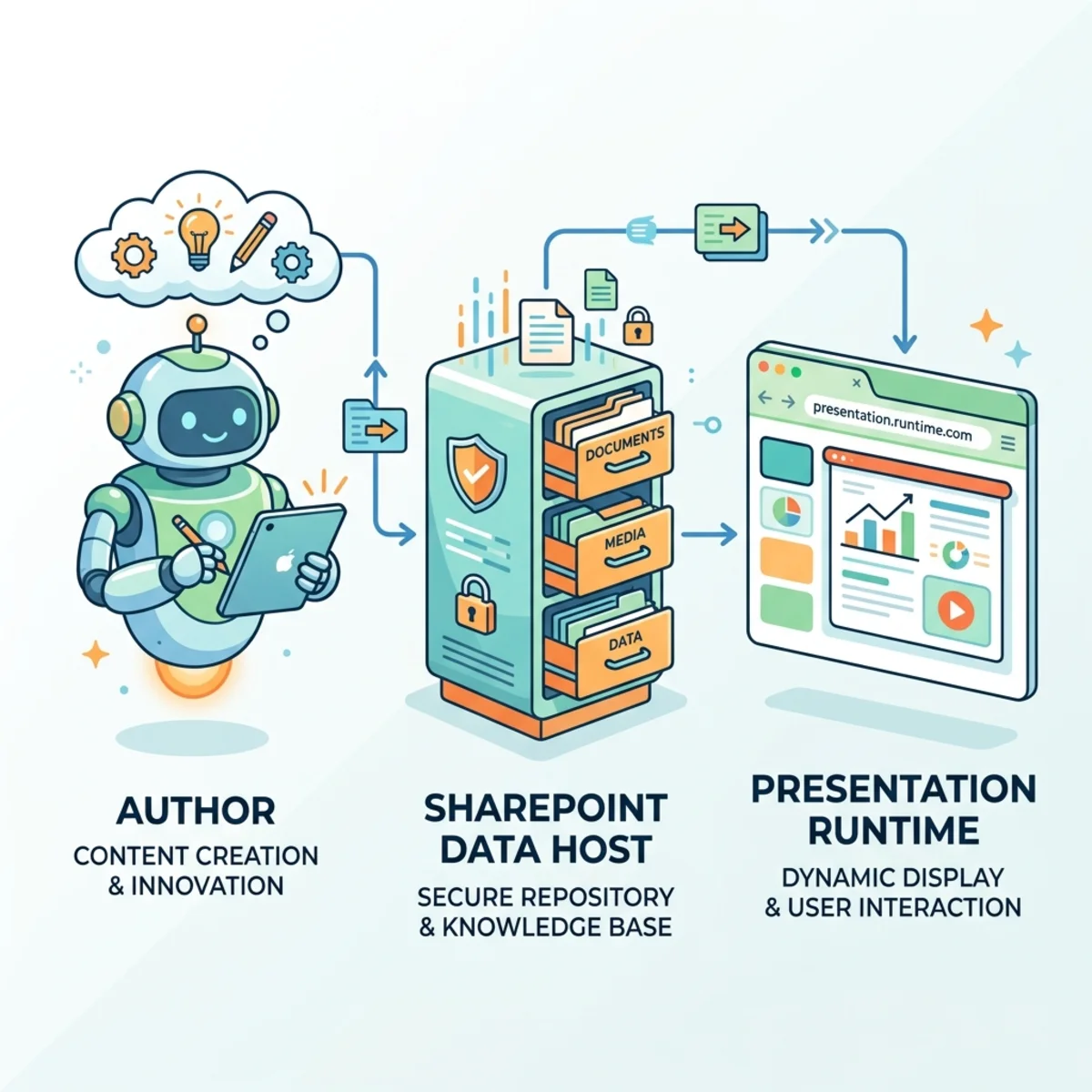
That distinction matters. It helps you use the feature confidently without confusing rapid report generation with full application development.
What Copilot in SharePoint actually adds
Copilot in SharePoint can use natural-language instructions to create SharePoint content, including sites, pages, lists, libraries, Office files, and interactive reports. Microsoft began moving the preview from tenant opt-in to opt-out rollout in mid-June 2026 for users with a Microsoft 365 Copilot license.1
For interactive reports, the workflow is straightforward:
- Identify the SharePoint content that should ground the report.
- Describe the intended audience, metrics, visual hierarchy, and interactions.
- Ask Copilot to generate an interactive HTML report.
- Preview the result and refine it conversationally.
- Validate the calculations, data scope, sharing behavior, and accessibility before wider use.
The authoring loop stays inside the SharePoint experience: the report can be previewed while Copilot chat remains available for follow-up instructions or questions about the grounded content. That side-by-side workflow is central to the experience because report creation becomes conversational rather than a sequence of manual HTML, CSS, and JavaScript edits.
Microsoft’s own example asks Copilot to create an interactive dashboard from quarterly sales content, including revenue, quota attainment, regional performance, trends, and filters.2 This tells us something important about the product’s center of gravity: it is designed to turn existing business content into a polished, shareable readout—not to replace every analytics or application platform.
The right mental model: generated report, not magic application
A modern HTML report can feel like an SPA because it may contain cards, charts, filters, tabs, tooltips, and other interactions without a traditional page reload. But visual similarity does not establish architectural equivalence.
A production SPA usually has explicit components for authentication, authorization, API access, state management, error handling, telemetry, testing, deployment, and lifecycle management. A generated HTML report may provide an app-like experience while remaining a lightweight artifact.
| Capability | Interactive HTML report | Production application |
|---|---|---|
| Primary goal | Rapidly communicate and explore information | Support a durable business process |
| Creation model | Natural-language generation and refinement | Designed, coded, tested, and deployed |
| Interaction | Filters, charts, drill-downs, and presentation logic | Transactions, workflows, APIs, and complex state |
| Data behavior | Depends on how the generated artifact references or embeds its source | Explicitly implemented data-access layer |
| Assurance | Requires human validation | Formal engineering, security, and operational controls |
| Best fit | Readouts, prototypes, summaries, and lightweight dashboards | Business-critical or long-lived solutions |
This is not a criticism. Lightweight artifacts are valuable precisely because they reduce the distance between “I have structured information” and “I can explain it clearly.” The mistake is treating the generated result as more durable or more dynamic than it has been proven to be.
Data freshness: verify the generated artifact
The original promise of a “live-linked” dashboard is attractive: change a list item, refresh the report, and see every total and chart recomputed. That behavior is technically possible if the generated HTML performs an authorized runtime query against the list. It is not, however, something to assume for every generated report.
The report can follow one of several data patterns:
- Embedded snapshot: Source values are copied into the generated artifact. Refreshing the page does not retrieve newer list data.
- Runtime retrieval: JavaScript requests current data when the report opens or refreshes.
- Regenerated report: Copilot reads the updated source and produces a new version of the artifact.
- Hybrid: Some values are embedded, while other elements are retrieved dynamically.
Microsoft’s July announcement confirms that Copilot can build interactive HTML reports from SharePoint content, but the published announcement does not promise that every report maintains a permanent live connection to every source type.2 Therefore, treat live refresh as a behavior to test, not a universal product guarantee.
A simple freshness test
Before distributing a report as “live,” run a controlled test:
- Record a known list value and the corresponding dashboard total.
- Change one source item by an obvious amount.
- Open the report in a new browser session or perform a full refresh.
- Confirm whether the value changes without asking Copilot to regenerate the report.
- Repeat with a user who has different permissions.
- Document the result as part of the report’s operating notes.
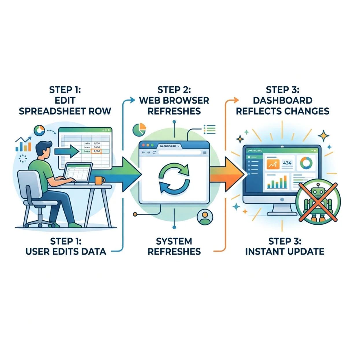
For example, the source demonstration showed a grant dashboard with 18 applications and approximately $1.33 million requested. After one grant request was changed to $275,000, refreshing the report changed the displayed pipeline total to approximately $1.538 million. That demonstration is evidence that the generated report in that scenario was retrieving current list data without rewriting the report. It should not be generalized into a guarantee for every source type or generated artifact. If the value does not change in your own controlled test, the artifact may be a snapshot or may require regeneration.
Security and permissions: hosting is not the same as proof
It is tempting to say that generated HTML is “safe because it runs in a SharePoint sandbox.” That is too broad without product documentation defining the exact execution boundary, permitted APIs, content restrictions, and isolation model.
A safer operating principle is:
Treat generated HTML as generated code. Preview it in the supported SharePoint experience, test it with representative accounts, and do not infer security properties that Microsoft has not documented.
Keeping the artifact in SharePoint can preserve familiar storage, sharing, retention, and access-management workflows. It does not mean that source permissions automatically follow the data after values have been copied into a separate report. If a user can read the report but not the original list, embedded source values may still be visible in the report.
Validate at least four boundaries:
- Source access: Which sites, lists, libraries, folders, or files did Copilot use?
- Artifact access: Who can open the generated report?
- Data exposure: Does the HTML contain embedded records or sensitive fields?
- Runtime access: If the report retrieves data dynamically, whose identity and permissions are used?
These checks are especially important for HR, health, financial, legal, and regulated datasets. Copilot accelerates authoring; it does not remove the publisher’s responsibility to review the output.
Compute cost: separate generation from viewing
There are two distinct activities:
- Generation and revision, where Copilot uses AI to create or modify the report.
- Viewing and browser interaction, where the generated HTML, CSS, and JavaScript render the experience.
If filters and calculations are implemented entirely in client-side JavaScript over data already available to the report, using those controls does not require a new model inference for every click. That is the useful technical insight behind the claim that refreshes consume “zero GPU cycles.”
But the absolute claim is too strong. A report might retrieve data from Microsoft 365 services, invoke another service, or need Copilot regeneration to reflect updates. Browser execution also uses device compute, and service requests still have platform cost even when no generative-AI call occurs.
The practical rule is:
Do not assume that viewing an artifact invokes Copilot. Do not assume that it never invokes a service. Inspect and test the generated behavior.
A repeatable workflow: from list to executive report
1. Prepare the source
Copilot works best when the source has a clear shape. Before asking for a dashboard:
- use descriptive list and column names;
- remove obsolete or duplicate columns from the reporting scope;
- normalize choice values such as region, phase, and status;
- decide which date field drives trends;
- identify calculated metrics and their formulas;
- define how blanks, cancelled records, and outliers should be handled;
- create a list view that contains only the relevant records and fields when possible.
A clinical-studies list with roughly 55 columns may be operationally valid, but an executive report rarely needs all 55. In the source demonstration, the synthetic dataset included enrollment status, health measures, portfolio-risk indicators, and other numeric fields. Copilot first produced a clean native executive view that still supported familiar list operations such as filtering, sorting, and grouping. The HTML report was the next step: it converted those rows into portfolio KPIs, a snapshot, risk indicators, visual summaries, and access to the underlying detail.
That sequence is a useful pattern:
- Start with a native view when the primary need is cleaner scanning and list operations.
- Move to an HTML report when leaders need aggregation, visual hierarchy, or richer interaction.
- Give Copilot a reporting contract: the population, measures, dimensions, exceptions, and audience.
2. Prompt for decisions, not decoration
“Make a dashboard” leaves too much unspecified. The source used a concise architecture-oriented instruction similar to this:
That may be enough for a useful first draft. More explicit instructions provide greater control over what Copilot emphasizes. A stronger production-oriented prompt defines the analytical job:
This prompt works because it specifies audience, questions, metrics, dimensions, interactions, presentation constraints, and data-quality rules.
3. Refine in layers
Avoid changing logic and appearance in the same instruction. Iterate in a controlled sequence:
- Validate scope: Are the correct items and fields represented?
- Validate calculations: Do totals, percentages, and groupings match the source?
- Add interaction: Introduce search, filters, sorting, tabs, or drill-downs.
- Improve information design: Adjust hierarchy, density, labels, colors, and tooltips.
- Test edge cases: Empty results, blanks, long labels, large values, and restricted users.
Useful refinement prompts include:
The source demonstration used the shorter instruction “Let’s make this interactive with live filters.” Copilot interpreted that request by adding filters for fields such as area, phase, and region, together with a search box for individual records. A later instruction asked it to reduce the vertical risk-indicator section and expose details through tooltip hovers. This illustrates both the strength and the risk of conversational iteration: users do not need to import JavaScript libraries or edit the generated code manually, but Copilot must interpret underspecified requests. Review each revision to ensure that presentation changes have not altered the underlying metrics.
The final freshness prompt is particularly important because it makes the report’s data behavior legible to the reader.
4. Use Copilot to improve the prompt—carefully
For a wide inventory or portfolio list, you can ask Copilot to inspect the available schema and draft a better dashboard specification. This is useful for discovering possible dimensions, filters, and image fields.
Do not feed the draft back blindly. Review it for:
- nonexistent columns;
- invented formulas;
- ambiguous definitions such as “at risk” or “overstocked”;
- sensitive fields that should not appear;
- expensive or impractical interactions;
- assumptions about data freshness.
Prompt generation is a planning aid, not a substitute for knowing the data.
Advanced patterns worth exploring
Image-rich catalog reports
The source’s second example used a synthetic product-inventory list containing shirts, pants, shoes, sizes, stock by store—including Portland, Seattle, and San Francisco—and links to individual product images. Copilot turned that data into a more obvious single-page-app-style experience with a left-side filter area, search, product cards, and click-through details that displayed the image and richer stock information.
This pattern can scale into a substantial browsing experience as the inventory grows, but the source list remains important. If it contains supported image references, the report can present items as cards with thumbnails, stock indicators, and details. Test broken links, inaccessible assets, large files, and whether the viewer has permission to retrieve each image.
Derived action views
A report can surface conditions such as understocked, overstocked, overdue, or at risk. The logic should be explicit rather than inferred invisibly.
For example:
In the inventory demonstration, Copilot introduced an Action Mode concept that filtered the list to items it considered overstocked or understocked. The useful idea was generated automatically, but the business definition was not explained. That turns “Action Mode” from a clever surprise into a governance problem unless the thresholds are made explicit. The revised prompt above converts the inferred behavior into an auditable rule.
Reusable visual instructions and skills
The source also described using Copilot skills or reusable design guidance to standardize colors and styling across generated experiences. The inventory example benefited from such design instructions, while the first clinical-studies report was initially shown without a styling skill to demonstrate the model’s out-of-the-box design choices.
Consistent color, spacing, terminology, component treatment, and accessibility guidance can make generated reports feel like a coherent family. Whether you express those requirements through supported skills, reusable organizational guidance, or a carefully maintained prompt template, keep branding separate from metric logic. A report can look perfectly consistent while calculating the wrong number.
Where this approach fits—and where it does not
Interactive HTML reports are a strong fit when you need:
- a fast executive or project readout;
- an exploratory dashboard over existing SharePoint content;
- a prototype before investing in a larger solution;
- a shareable visual summary with filters and charts;
- an app-like presentation without starting a software project.
Use a more engineered platform when you need:
- certified semantic models and governed measures;
- scheduled refresh with service-level expectations;
- row-level security that has been formally designed and tested;
- write-back, approvals, or transactional workflows;
- complex integrations or cross-system APIs;
- automated testing, telemetry, source control, and deployment pipelines;
- long-term support for a business-critical application.
The choice is not “Copilot or Power BI” or “Copilot or custom development.” The better question is: What level of durability, assurance, and data behavior does this use case require?
Final perspective
Copilot in SharePoint changes the first mile of dashboard creation. Instead of beginning with a blank canvas, users can begin with business intent: the audience, the decisions, the measures, and the interactions. Copilot can then turn SharePoint content into an interactive HTML report and refine it through conversation.12
The breakthrough is not that every SharePoint list has suddenly become a production SPA. It is that the distance between structured enterprise content and a useful interactive explanation has become much shorter.
Use that speed—but keep the engineering disciplines that matter:
- define the metrics;
- verify the data scope;
- test freshness rather than assuming it;
- review permissions and exposure;
- validate the generated calculations;
- and choose a production platform when the solution becomes business-critical.
That is how an impressive Copilot demo becomes a trustworthy SharePoint reporting pattern.
Sources
Footnotes
-
Microsoft Learn, Get started with Copilot in SharePoint (preview). Accessed July 29, 2026. ↩ ↩2 ↩3
-
Microsoft SharePoint Blog, What’s New in Copilot in SharePoint: July 2026, July 16, 2026. ↩ ↩2 ↩3 ↩4
Read next