Escaping AI Slop: A Practical System for Design Taste

Writer
AI coding agents can produce valid, responsive frontend code at remarkable speed. What they do not reliably provide is a coherent point of view.
Ask an agent to “make it premium,” and it often reaches for the statistical center of contemporary interface design: familiar sans-serif typography, rounded cards nested inside more rounded cards, centered feature grids, soft gradients, and decorative motion. None of these choices is inherently bad. The problem is convergence. When every decision is individually plausible but collectively unsurprising, the result feels generated rather than designed.
This is often called AI slop. It is not simply ugly UI, and it is not evidence that the code is poor. It is design produced from defaults rather than intent.
The way out is not a longer adjective list. It is a better design process.
The central idea: Treat the model as an execution engine, not as the source of taste. You supply the references, priorities, constraints, and judgments; the agent explores and implements within that frame.
The workflow has three stages:
- Cultivate taste: build a categorized library of references and learn the vocabulary behind them.
- Extend the agent: add flexible design guidance, component references, and media-generation tools.
- Build by iteration: prompt with intent, compare alternatives side by side, and progressively narrow the design.
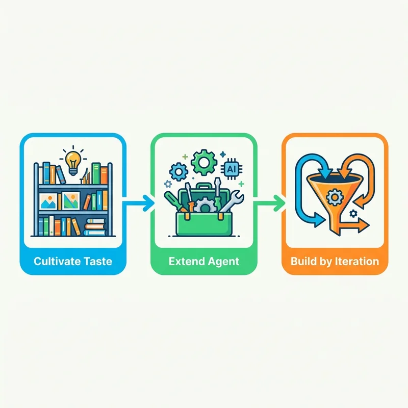
Together, these stages replace the “prompt lottery” with a repeatable—but deliberately non-prescriptive—process.
What “taste” means in an AI workflow
Taste can sound mystical, but in this context it is operational. It is the ability to make consistent choices about:
- hierarchy: what should dominate and what should recede;
- typography: how type creates voice, rhythm, and structure;
- composition: how the page uses alignment, scale, density, and empty space;
- color: where contrast carries meaning rather than decoration;
- motion: which transitions clarify state or direct attention;
- restraint: which plausible elements should be omitted.
An agent can implement all of these. The difficult part is deciding which combination belongs to this product, audience, and message.
A useful mental model is to think of the agent as a highly capable session musician. It can play almost anything, but “make it sound good” is not a score. A genre, reference track, tempo, arrangement, and a producer who can reject the wrong take will produce a much better result.
1. Build a taste library before you prompt
A reference library is not a folder of attractive screenshots. It is a set of reusable design decisions.
Collect examples from design galleries, product sites, editorial layouts, portfolios, component libraries, and real applications. Dribbble and Pinterest are useful for broad visual exploration; X can surface work-in-progress, experiments, and micro-interactions shared directly by designers and frontend developers. 21st.dev is more implementation-oriented, indexing React and Tailwind components that can be inspected as lower-level references.
Save both screenshots and source URLs. A screenshot preserves a particular state; a URL lets the agent inspect a page’s broader rhythm, responsive behavior, and body layout when browsing is available. References should not be confined to heroes: collect navigation systems, long-form body structures, ledgers, framed sections, indexes, forms, calls to action, and footers as well.
Do not collect only complete landing pages. Save evidence at several levels:
- Page systems: overall composition, section rhythm, and narrative flow
- Typography: type pairing, scale, line length, and label treatment
- Components: navigation, buttons, forms, pagination, and data displays
- Surface details: borders, shadows, texture, illustration, and icon treatment
- Motion: entrances, transitions, hover behavior, and scroll choreography
For every reference, record why it works. “Looks cool” is not actionable. “The oversized serif headline creates editorial authority while the narrow body column keeps the page readable” is.
Organize references into aesthetic families
Group references by shared principles rather than by industry. You might create families such as:
- Vast Quiet: large fields of negative space, restrained type, sparse imagery
- Dither Mono: monochrome imagery, pixel texture, technical typography
- Print Tech: editorial grids, paper-like surfaces, strong rules and labels
- Dense Instrument: compact controls, high information density, minimal decoration
These names are internal shorthand, not established design categories. Their value is consistency: each label should point to a documented combination of typography, spacing, imagery, color, and motion.
A small local reference app can make the library easier to use. Store the image, source URL, creator, usage rights, tags, and your analysis. Add two export actions: Copy image prompt for generating a compositionally compatible hero asset, and Copy brief for carrying the selected aesthetic family into the full website build.
Rights matter: A public image is not automatically licensed for reuse. Keep source and permission information, and use references to study design principles—not to reproduce another creator’s work. Pinterest’s terms govern use of content on its service, and independent copyright guidance likewise warns that pinned images are not automatically copyright-free.
2. Give the agent constraints and tools—not aesthetic autonomy
AI design tooling falls into three useful layers: design guidance, asset generation, and component sourcing.
Design guidance: Impeccable
Impeccable is an open-source design-guidance system for AI coding agents. Its documentation exposes a family of commands—including critique, audit, polish, bolder, quieter, clarify, and overdrive—plus a detector CLI and live browser iteration. The project’s command set and detector rules evolve, so treat headline counts such as “23 commands” or “46 slop patterns” as version-specific rather than permanent product guarantees.
The broader value is its coverage across the disciplines that make an interface feel intentional: typography, color, spatial design, responsive behavior, interaction, motion, and UX writing. It is not a magic style generator. It gives the agent a vocabulary, persistent project context, and checks for recurring patterns such as nested cards, flat hierarchy, overused fonts, decorative gradients, and weak contrast.
Use it as a critic and steering mechanism:
- initialize project and design context;
- ask for a critique before requesting changes;
- choose a directional command based on the diagnosis;
- inspect the rendered result;
- keep, revert, or refine the change.
The current quick-start path is:
Then initialize project context with /impeccable init. For browser-based comparison, /impeccable live overlays the running development server, lets you select an element, generates alternatives, and can write an accepted variant back to source. Live Mode is still labeled alpha in the command reference, so expect rough edges on unusual framework configurations.
Do not treat every detected pattern as a universal error. Inter, gradients, centered layouts, and rounded cards can be correct choices. The warning is about unexamined repetition, not prohibition.
A lighter constraint layer: Taste Skill v2
Taste Skill is a portable set of instructions for coding agents. Its documentation describes v2 as experimental and says it interprets the brief before selecting layout variance, density, and motion. It also includes explicit anti-pattern rules and an audit-first redesign protocol.
This is useful when you want persistent design rules without adopting a larger command workflow. The default design-taste-frontend install currently points to experimental v2:
Because v2 remains experimental, pin a known revision—or explicitly retain the legacy v1 skill—when repeatability matters. Review updates before allowing them to alter an established design system.
Asset generation: Higgsfield MCP
Code generation and media generation are separate capabilities. Model Context Protocol, or MCP, is an open standard that lets AI applications connect to external tools and data sources; Claude Code supports MCP servers for precisely this kind of tool integration.
Higgsfield provides agent-facing skills and a CLI for image and video generation. Its current Claude Code setup installs the CLI, authenticates in a browser, and adds companion skills:
Higgsfield also exposes multiple image and video models, including Seedance 2.0. Model catalogs and “best model” judgments change quickly, so select a model for the current job rather than hard-coding a fashionable name into the workflow. Likewise, request “2K” only after checking that the selected model and access path actually support that output.
The important workflow change is that the agent can request and save visual assets without forcing you to manually shuttle prompts and files between applications. But the generated media still needs human review for composition, continuity, brand fit, licensing terms, and accessibility.
Component sourcing: 21st.dev
21st.dev is useful at the component level. Its official site describes a large catalog of React and Tailwind components and provides prompts or source code intended to land in a project for further adaptation.
Use it to avoid rebuilding a specialized interaction from memory. It complements the macro references in the taste library: the library steers the page’s aesthetic system, while 21st.dev can expose options for buttons, cards, backgrounds, calls to action, pricing sections, or pagination that you may not have considered.
Do not paste a component blindly. Check:
- accessibility and keyboard behavior;
- dependencies and framework compatibility;
- responsiveness;
- design-token alignment;
- performance cost;
- whether its visual language actually belongs in the page.
Avoid the tool rabbit hole
A common failure mode is assuming the next skill or plugin will solve taste. Highly prescriptive tools can produce an impressive demo while quietly locking every project into the same narrow style. Prefer tools that widen your vocabulary and support multiple directions. Even then, flexible tools cannot decide what “good” means for your product; references, prompting, comparison, and judgment still carry the process.
3. Use a four-part prompt architecture
Huge design prompts tend to mix goals, implementation details, references, and prohibitions into one brittle specification. A shorter, modular prompt is easier to inspect and revise.
Build each major request from four parts:
| Element | Question it answers | Example |
|---|---|---|
| Aesthetic | What visual family are we working in? | Use the “Print Tech” system from the project brief. |
| Reference | What concrete evidence anchors the direction? | Use the attached page for typographic tension and density, not for its layout. |
| Intent | What must the interface help the user do? | Explain the analytics product quickly and make the demo action unmistakable. |
| Guardrails | Which defaults would undermine the direction? | Avoid nested cards, decorative gradients, and motion without state or hierarchy value. |
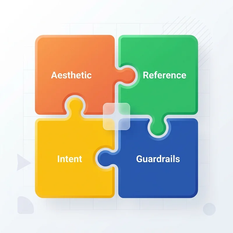
A complete prompt might read:
Design the landing page in the project’s Print Tech aesthetic. Use the attached reference for its typographic contrast, ruled grid, and image treatment, but do not copy its composition. The product helps small teams interpret AI analytics; the primary action is booking a demo. Avoid nested cards, generic three-column feature sections, purple gradients, and decorative 3D blobs. Preserve semantic HTML, responsive behavior, keyboard access, and reduced-motion support.
Notice the difference between positive direction and negative guardrails. Guardrails can stop familiar failure modes, but prohibitions alone do not create a visual identity.
4. Build through divergence and convergence
Do not one-shot the website. Use a funnel: produce meaningfully different options, choose a direction, then make increasingly local decisions.
Phase 1: Diverge on art direction
Generate three to five low-cost variants using different aesthetic families. For a fictional AI analytics product such as Kestrel, that might mean Print Tech Paper, Vast Quiet, Dither Mono, Classical Remix, and a fifth family from your library. Specify the audience and conversion goal—such as a small startup team booking a demo—once, then keep them stable across all variants.
At this point, placeholder graphics generated by the coding agent are acceptable. The goal is to choose art direction, not to finish the hero. If you are comparing design-guidance systems such as Impeccable and Taste Skill, render their outputs side by side under the same brief; otherwise, you are comparing different prompts rather than different guidance.
At this stage, judge:
- Does the hierarchy explain the product without narration?
- Does the aesthetic support the audience and message?
- Is the page distinctive for a reason, or merely unusual?
- Can the direction scale beyond the hero?
Do not spend time polishing animations or final assets yet.
Phase 2: Explore structure within the winning direction
Once an aesthetic wins, hold it constant and vary the composition. For example:
- a conventional vertical narrative;
- a left-anchored ledger with persistent navigation;
- a framed editorial layout with strong section boundaries.
This isolates the layout decision. If you change typography, palette, imagery, and structure simultaneously, you will not know which change improved the page.
Phase 3: Generate imagery for the chosen composition
Lock the approximate crop, focal point, text-safe region, aspect ratio, palette, and contrast before generating hero imagery. Ask for several compositionally distinct candidates—not four cosmetic variations of the same scene. A useful first pass might compare an aerial landscape, a rocky crag, a watercolor treatment, and a cloud sea, all fitted to the same hero composition.
Review them inside the hero. Reject an image if its focal detail collides with the headline, even if the standalone image is attractive. Then iterate on the strongest candidate with precise changes: warmer edge light, lower horizon, less visual noise behind the headline, a dawn or golden-hour treatment, or a restrained alpenglow accent. Avoid accepting an aggressive duotone merely because it is visually loud. Evaluate the asset in the page, not in isolation.
Phase 4: Tune motion and local details
Motion is not the “premium” switch. Good motion communicates hierarchy, causality, or continuity. Prefer deliberate entrances and state transitions over constant spectacle.
Review:
- page-load sequencing;
- transition between hero and body;
- hover and focus feedback;
- scroll-triggered reveals;
- reduced-motion behavior;
- mobile performance.
If the chosen direction calls for visual weight, stagger page-load elements and soften the transition from hero to body rather than cutting abruptly between them. “Heavy” should mean deliberate timing and perceptual weight—not slow interaction or blocked input.
A temporary tweaks bar can accelerate this final pass. Add local controls for heading font, body font, type scale, italics, accent color, hero asset, section spacing, motion weight, reveal distance, duration, and easing. Use it to compare values in the browser, then write the selected values back into tokens and remove the panel before release.
5. Add an explicit evaluation loop
The original prompt is not the final authority. The rendered interface is.
After each substantial iteration, evaluate the page against the same questions:
Identity
- Could this page belong to ten unrelated startups after replacing the logo?
- Can you state its visual rules in one sentence?
Communication
- Is the main proposition understandable in a few seconds?
- Does the hierarchy match user priorities?
Coherence
- Do typography, imagery, spacing, components, and motion express the same direction?
- Are exceptions intentional?
Quality
- Does the design remain usable on narrow screens?
- Are contrast, focus states, semantics, and reduced-motion behavior sound?
- Does the implementation preserve performance?
Restraint
- Which element can be removed without losing meaning?
- Is any visual effect compensating for weak structure?
This loop is where human taste enters the system. The agent can generate alternatives, but someone still has to recognize the stronger choice and explain why.
What these tools cannot solve
No CLI, skill file, component catalog, or media model can guarantee good design.
They cannot replace:
- accurate product positioning;
- user research;
- content hierarchy;
- accessibility testing;
- brand judgment;
- cross-device review;
- permission to use third-party assets;
- the willingness to reject a competent but generic result.
Tool output also changes. Commands, detector counts, model availability, and experimental features can evolve quickly. Treat documentation as the source of truth, pin dependencies where reproducibility matters, and avoid building a workflow around an unverified capability.
References and version notes
Product capabilities change quickly. These were the primary references checked for this revision:
- Impeccable documentation and Live Mode command reference
- Taste Skill repository and v2 documentation
- Higgsfield CLI setup and Higgsfield Skills
- 21st.dev component library and 21st help center
The aesthetic-family names and the Kestrel walkthrough are illustrative workflow examples, not standardized design categories or measured benchmarks.
The rule of thumb
Escaping AI slop is not about finding the perfect anti-slop prompt. It is about replacing one-shot generation with a directed design loop:
- Curate references and explain why they work.
- Encode the chosen direction as a brief and reusable constraints.
- Diverge across a small number of genuinely different options.
- Converge by holding some variables constant while testing others.
- Evaluate the rendered interface against identity, communication, coherence, quality, and restraint.
- Refine locally, then remove temporary experimentation tools.
AI can compress the distance between an idea and a working interface. It does not remove the need for taste; it makes taste more consequential. When implementation becomes cheap, the quality of the brief, the references, and the decisions becomes the real differentiator.
Read next